A visit with Martin Holzapfel
In Harmony
-

Designer Martin Holzapfel at home in his Berlin altbau
All slideshow photos © Pedro Gething for Pamono
-

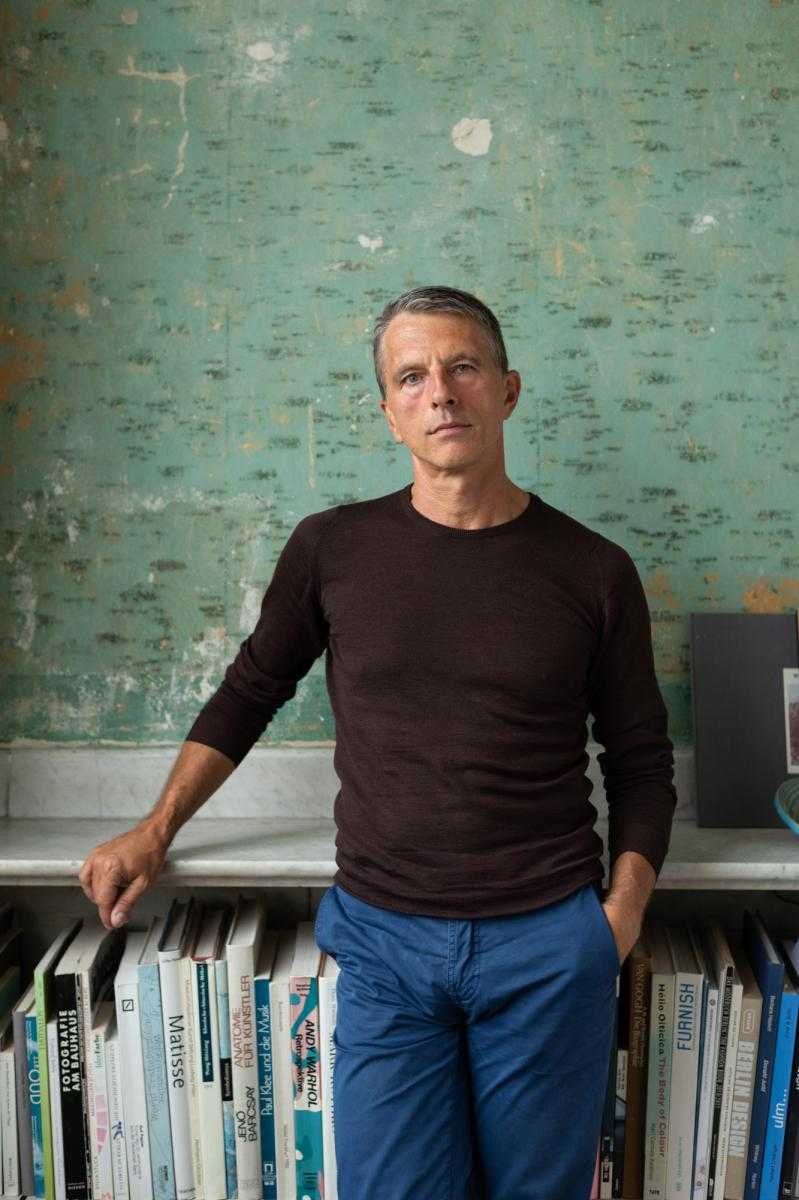
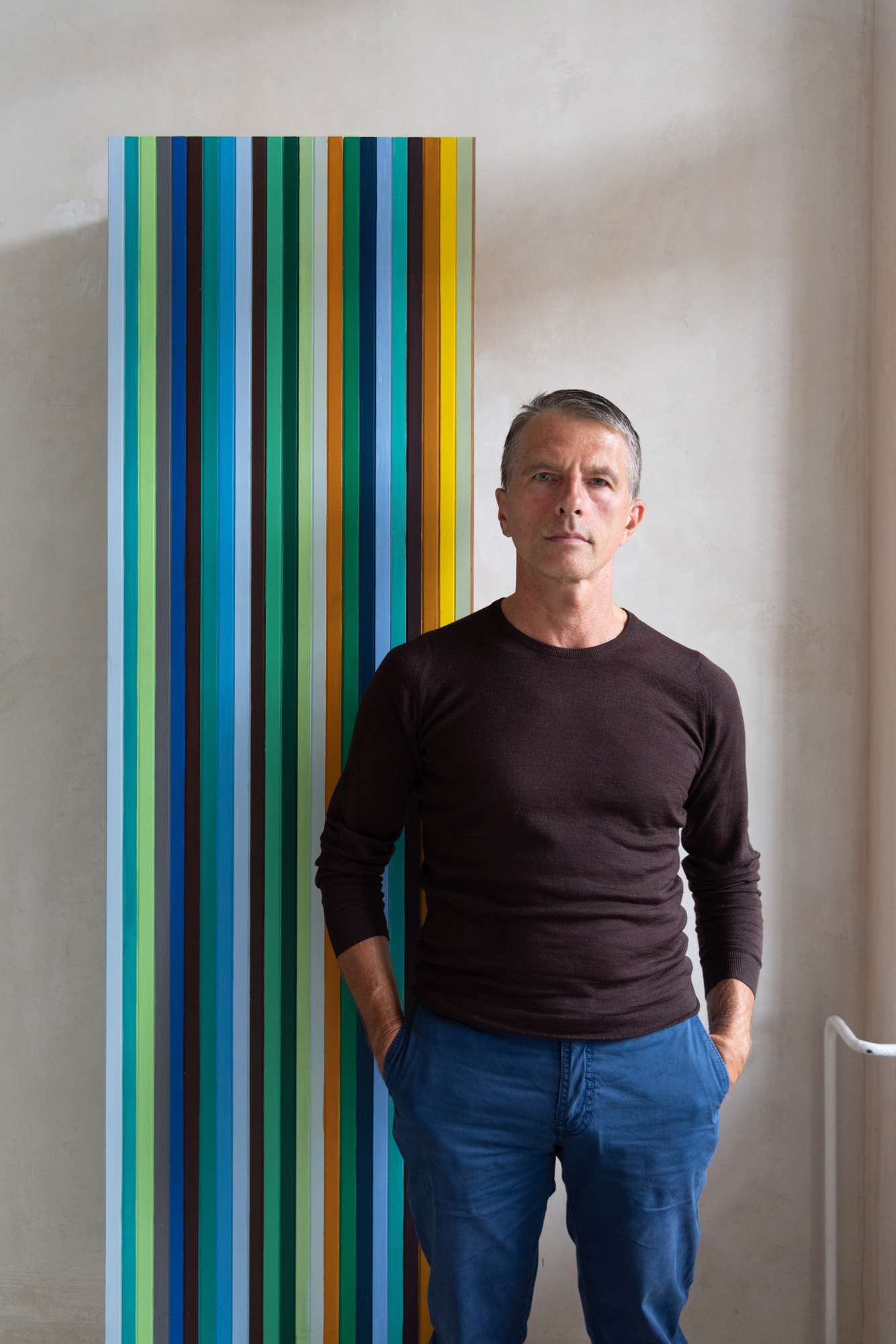
Berlin designer Martin Holzapfel
-

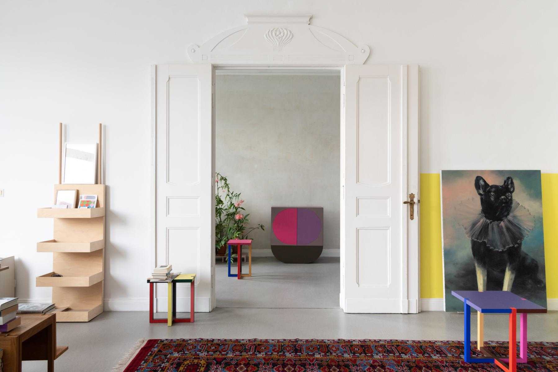
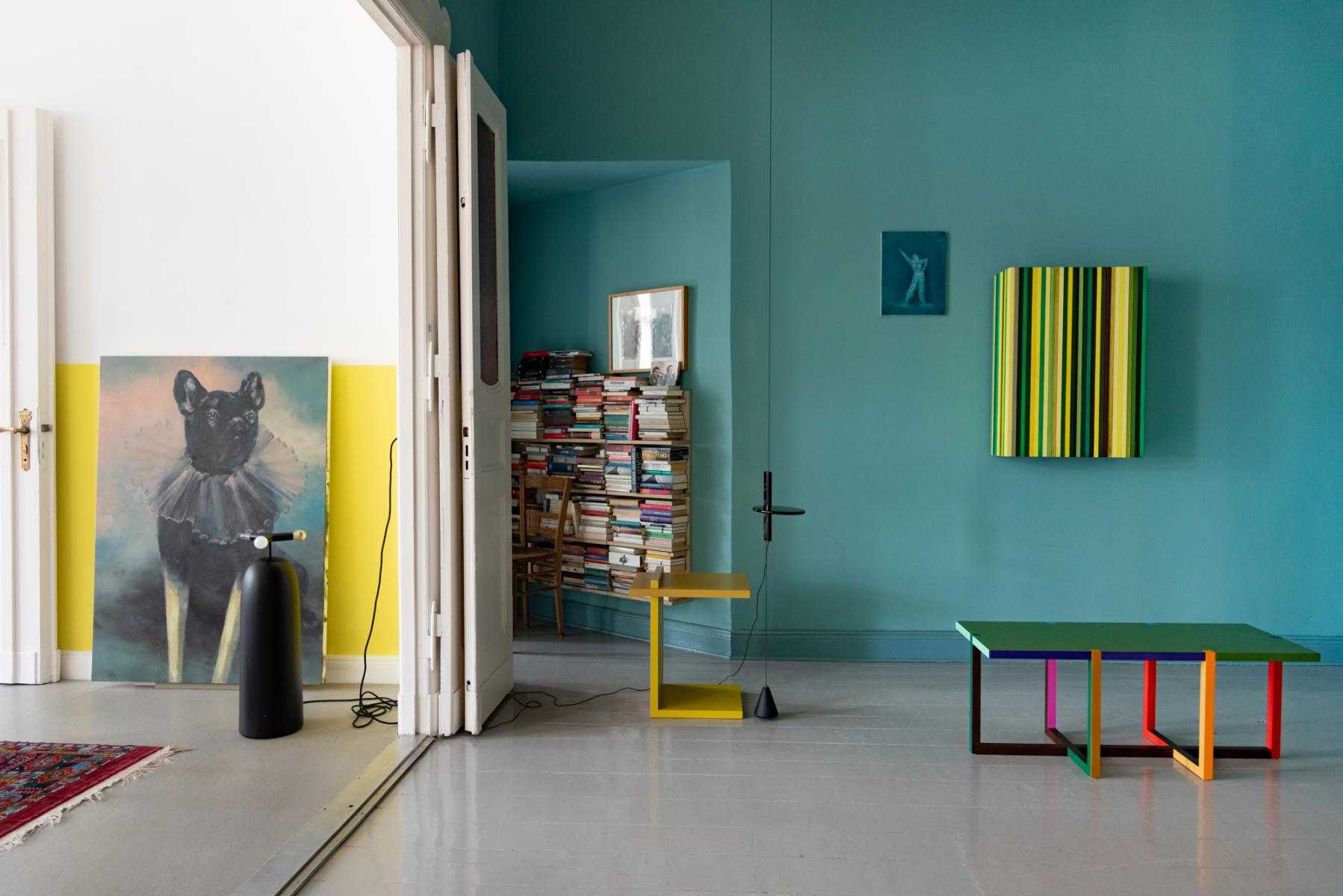
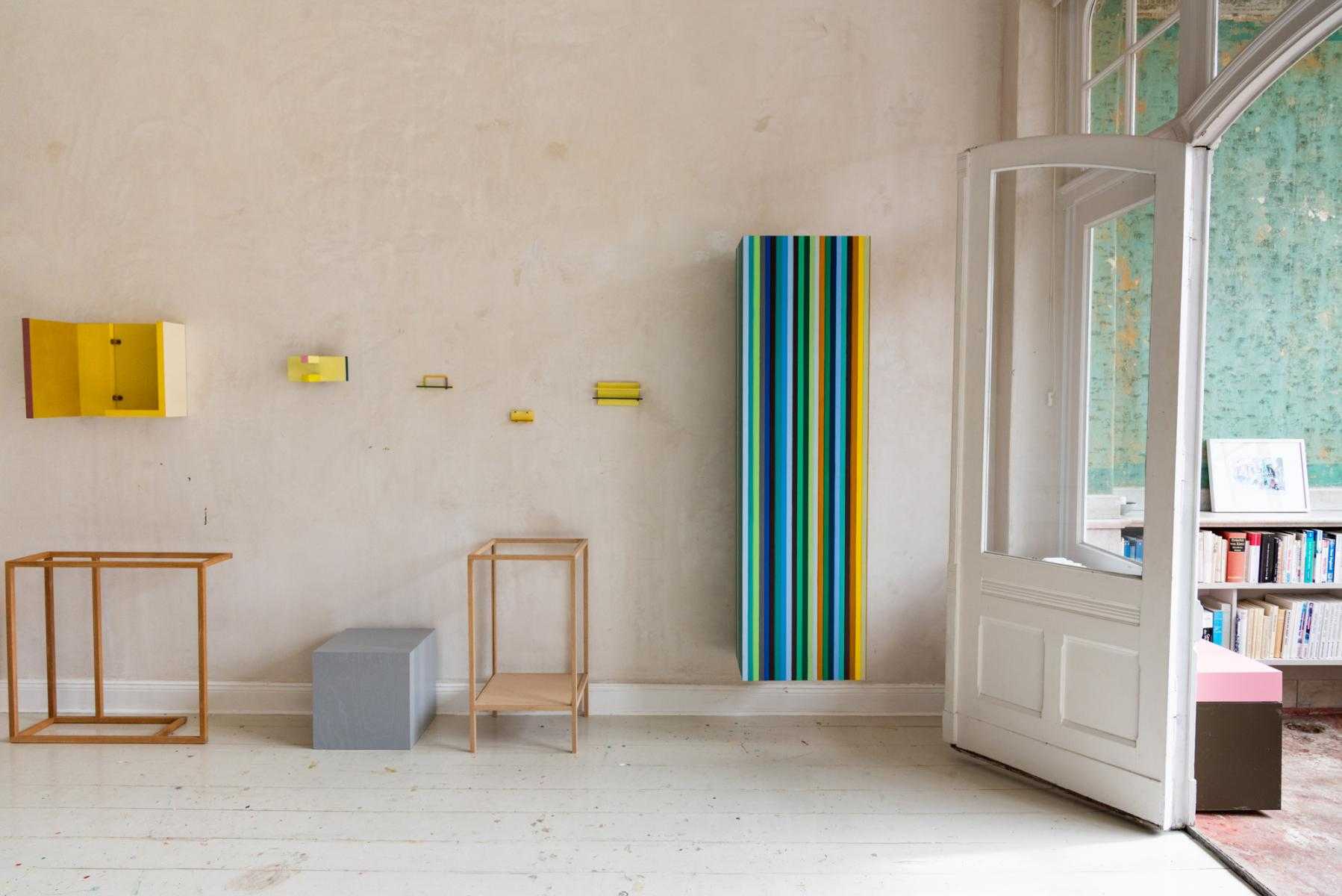
Holzapfel’s home features historical details complemented by his own boldly colorful, contemporary designs
-

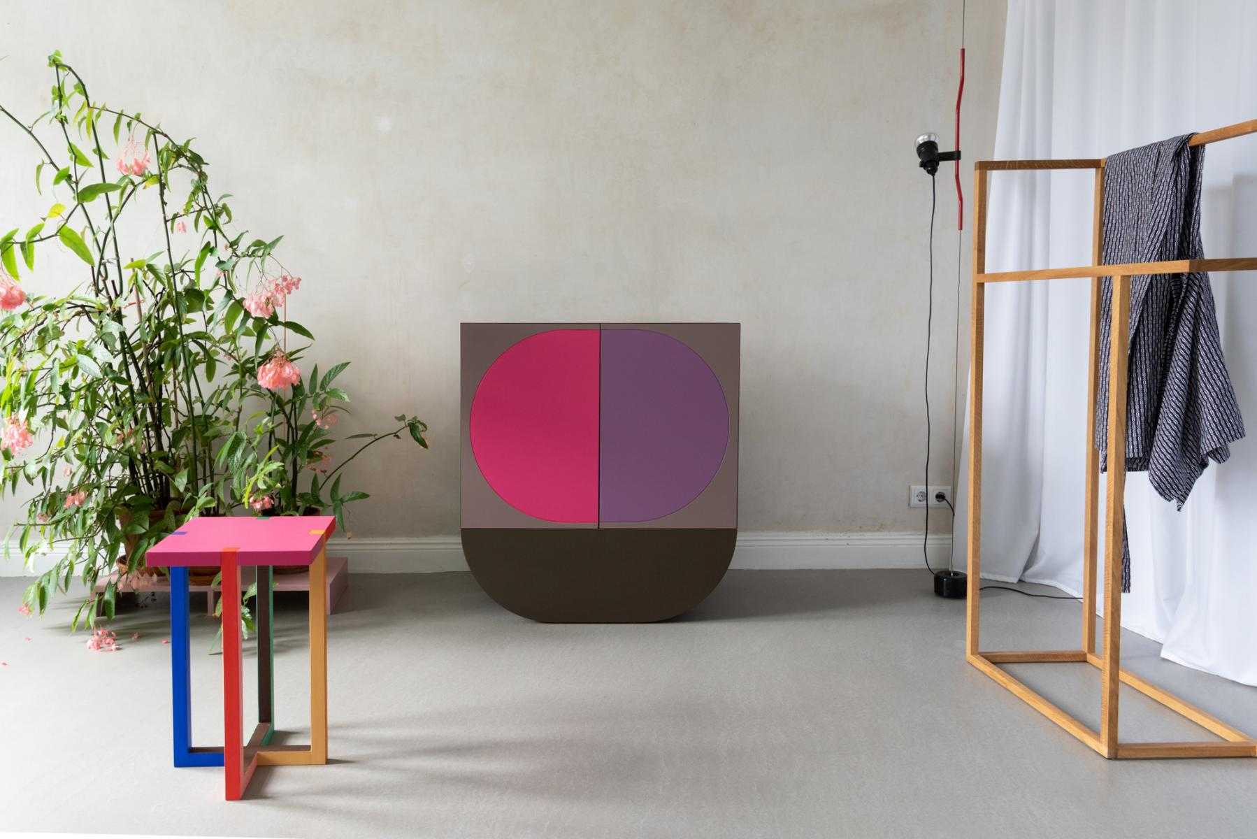
Holzapfel’s work celebrates simple forms and color-driven designs
-

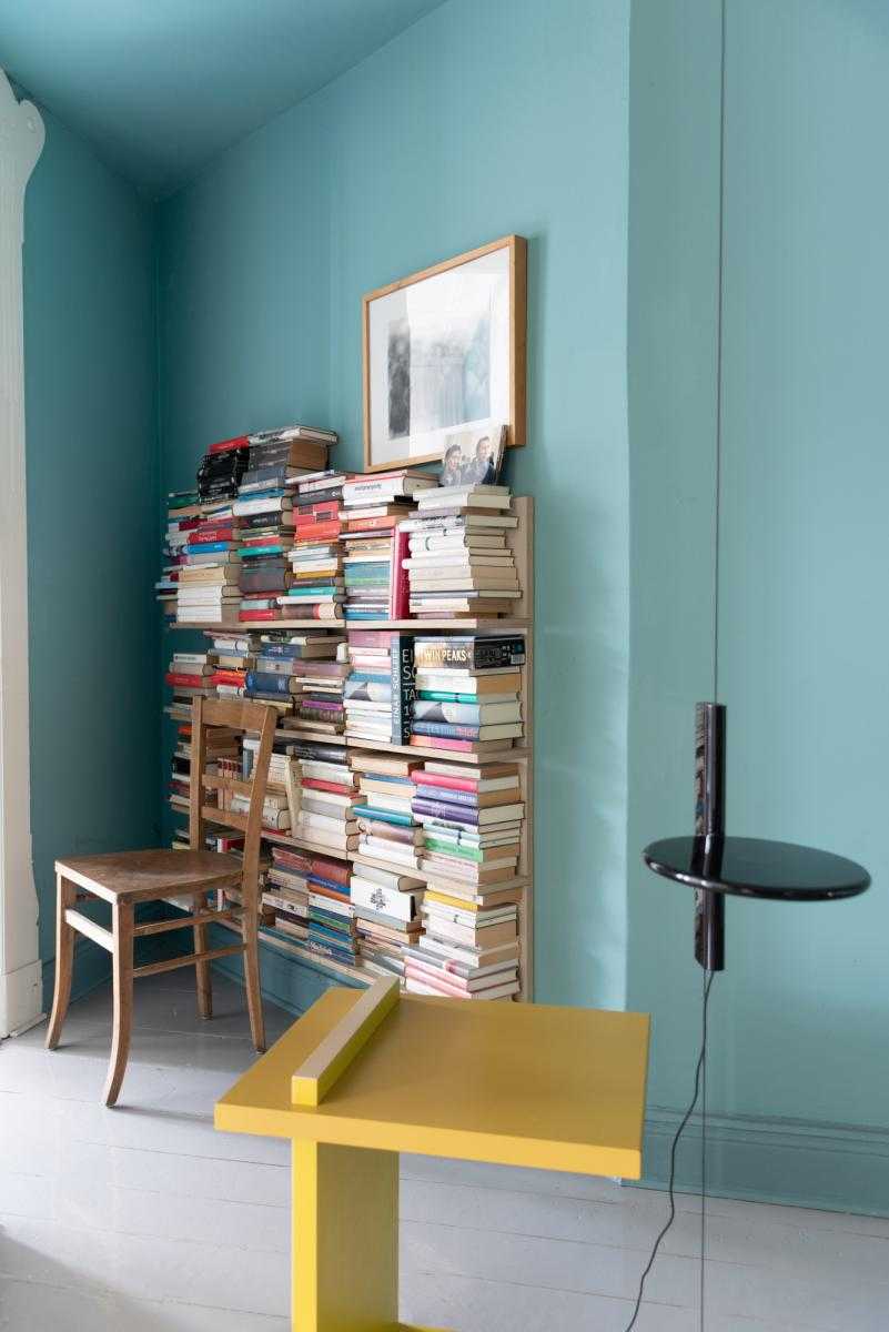
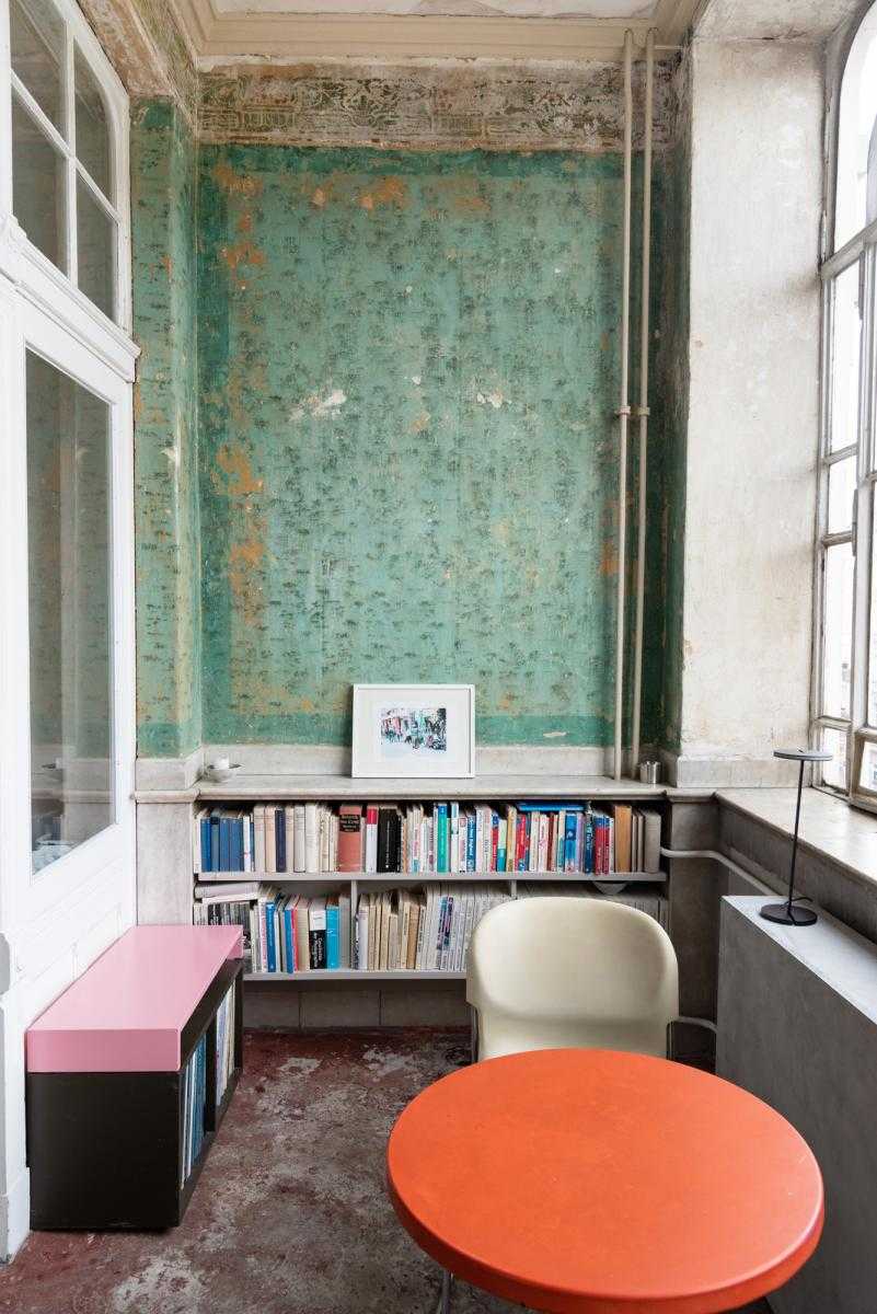
A colorful corner
-

Holzapfel’s unique space
-

Vintage and contemporary objects blend easily in Holzapfel’s bright home
-

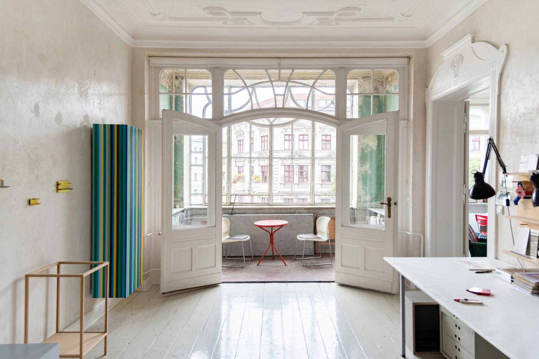
View from the workshop area
-

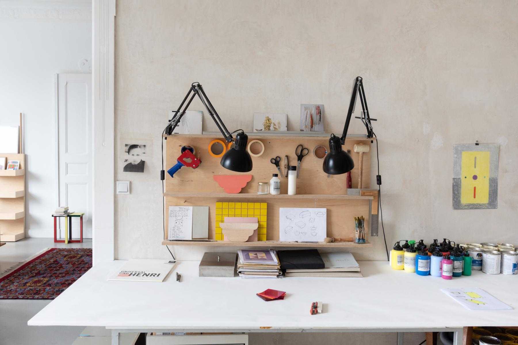
Holzapfel’s workshop space, where he drafts, builds, paints, and more
-

A mix of geometrical works
-

A quiet nook in the sunroom
-

Martin Holzapfel
-

Martin Holzapfel
-

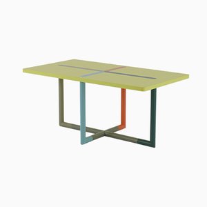
Holzapfel’s kitchen displays his colorful Crossing Dining Table
-

Inside Holzapfel’s kitchen
-

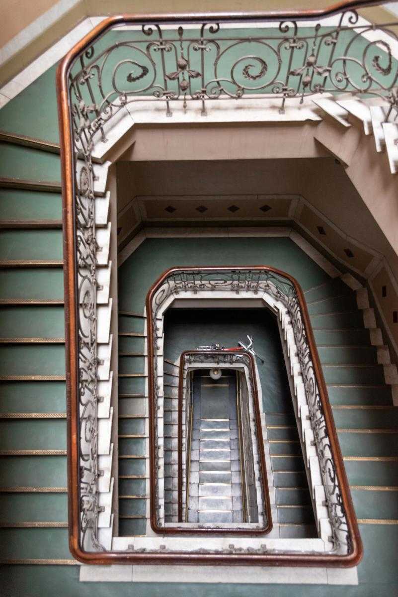
Holzapfel’s building stairwell
-

Holzapfel’s building is situated in Berlin’s vibrant Gesundbrunnen district
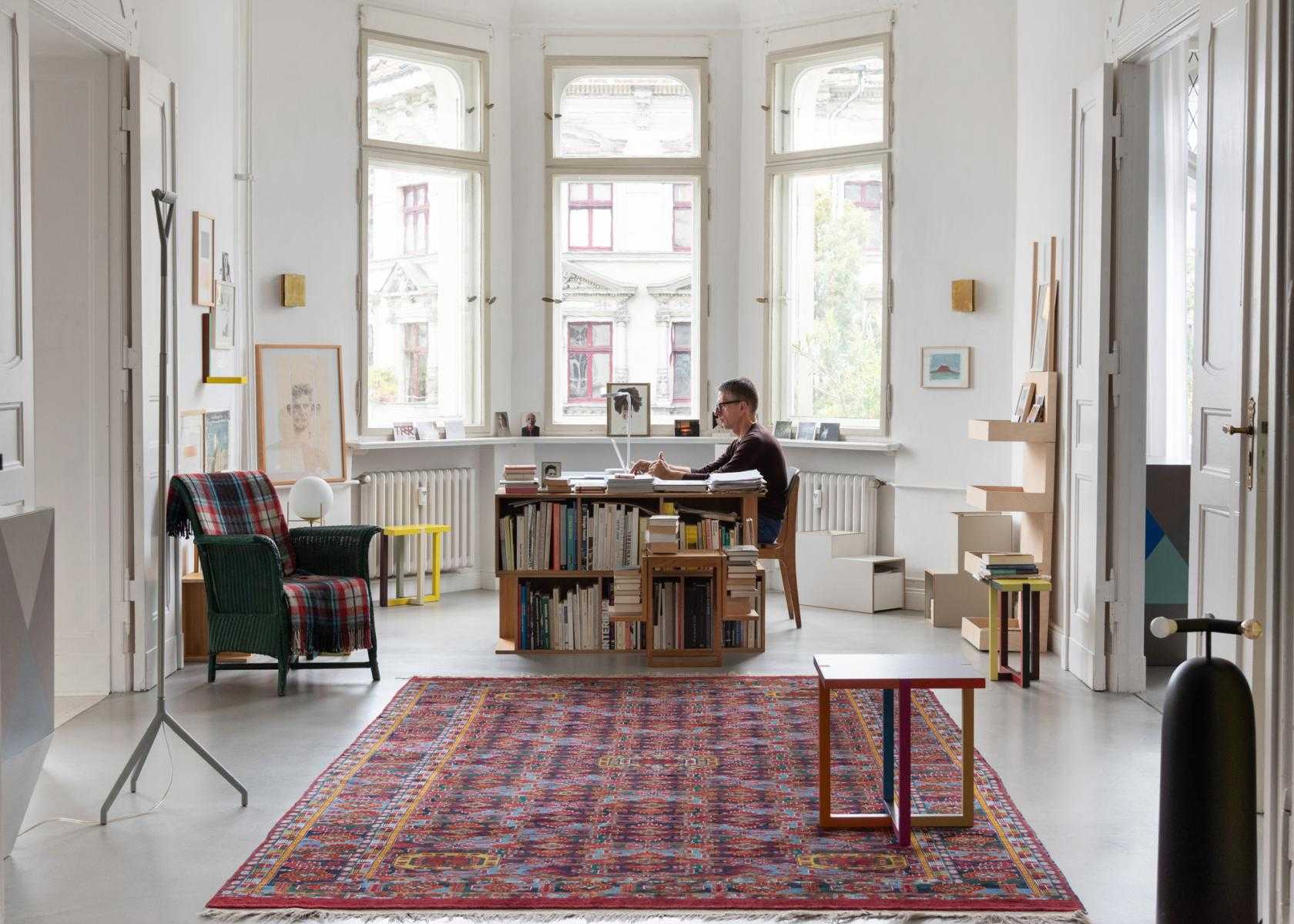


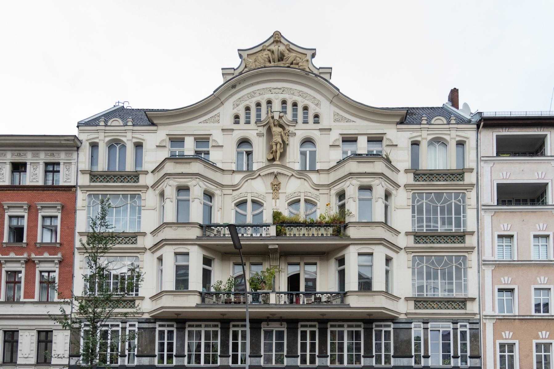
One recent morning, we had the pleasure of sharing a few hours with Berlin designer Martin Holzapfel. Over coffee in his gorgeous home-slash-studio—a romantic altbau in Berlin’s vibrant Gesundbrunnen district, all decadently high ceilings and original, turn-of-the-century details, complemented by Holzapfel’s own boldly colored pieces—we discussed inspiration and creative evolution. Holzapfel, who has called the capital city home for nearly two decades, is at once a quiet, calming presence and contagiously passionate. He adores modern art and architecture, music, and the kinetic, creative spirit of Berlin.
Seated in Holzapfel’s peaceful sunroom, looking down on the busy streets below and enveloped by perfectly peeling, teal-green-painted walls, we got to know this very special person just a bit more. Read on for highlights from our conversation.
Anna Carnick: How would you describe Berlin’s appeal to working designers? Does the city offer certain advantages or disadvantages?
Martin Holzapfel: I would call the city’s unique dynamism an advantage for designers. When I moved to Berlin at the beginning of the millennium, the recent fall of the Berlin Wall had just opened up new spaces in the city, and two different social systems were meeting directly for the first time. This encounter created new impulses that still shape the special mood and excitement of the city to this day. This peculiarity attracted many creative people, which also helped make the city a rich cultural place. As a very young and fast-growing cosmopolitan city, the possibilities and incentives for designers continue to expand.
For me, Berlin—and my neighborhood especially—offers a mix of cultures and access to art and music and other inspirations that are invaluable.
 Holzapfel at home
Photo © Pedro Gething for Pamono
Holzapfel at home
Photo © Pedro Gething for Pamono
AC: Your work consistently celebrates both color-driven designs and simple forms. Given these larger threads, how would you describe the aesthetic evolution of your designs?
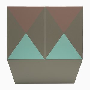
MH: Initially, my furniture objects were often monochrome, such as the pieces Bureau and Elephant, or two-tone like the sideboard Dock150. The minimalist forms were emphasized by the monochrome color choices. In the course of my investigations of form and color, though, the furniture became multicolored, as in Regard Cabinet and Crossing Table. With these later pieces, I am interested in the relationship between two-dimensional surfaces and three-dimensional forms, graphic images and the corresponding forms. Further work has been created, such as the Draft series, which operates with maximum color. Here, the color combinations almost dissolve the shapes. Overall, it is a way of harmonizing the function, the shape, and the color of the furniture as equally as possible. In other words, the aim was to find a perfectly balanced intersection of design, sculpture, and painting. It’s all about finding new, unexpected expressions—at once complex and simple.
AC: Speaking of sculpture and painting, a number of your pieces call to mind 20th century geometric abstract art. Can you tell us a bit about the impact that other art forms—and specifically modern art—have on your work?
MH: Modern art and architecture are key to my work. Inspiration from other areas can open up new paths in design. The study of art, architecture, and beyond extends the understanding of spatiality and color. It opens the view beyond the practical-functional.
AC: Are there certain artists you find particularly inspiring?
MH: First and foremost, I was influenced by the architect Le Corbusier, who was able to unite all the arts in his work. I also adore American minimal art of the ’60s—and especially artists like Donald Judd, Frank Stella, Richard Artschwager, Ellsworth Kelly—as well as Concrete Art of the ’50s and artists like Max Bill, Richard Paul Lohse, and Günter Fruhtrunk.
My inspiration comes mostly from artists who do not bow to the notion of limits.
 Holzapfel’s Crossing Dining Table
Photo © Martin Holzapfel, courtesy of the designer
Holzapfel’s Crossing Dining Table
Photo © Martin Holzapfel, courtesy of the designer
AC: What about music?
MH: To me, color is much like music. When I design, I use different notes or hues to create tension or to create harmony. For me, as a designer, color is generally the emotional element, while the form is frequently the functional part.
I believe music is the art form that touches us most directly. Color also produces its own sort of sound. Thus, the use of color—singularly and in combination—can create a melody, a rhythm, a mood. It makes the object attractive and, in the best cases, alive.
AC: Are there any musical genres you're especially drawn to?
MH: As a source of inspiration, I especially like contemporary classical works like those of American minimal music composer Steve Reich or compositions by Hungarian-Austrian György Ligeti. Likewise, electronic music and modern jazz really move me. As with art, I'm interested in music that explores and pushes boundaries in terms of composition.
AC: What’s on the horizon for you?
MH: This coming spring, I’m looking forward to participating in an exhibition at the Direktorenhaus here in Berlin, together with designers Elisa Strozyk and Zascho Petkow . Please come by!
Thank you, Martin!!
*This interview has been edited and condensed for clarity and length.
-
Text by
-
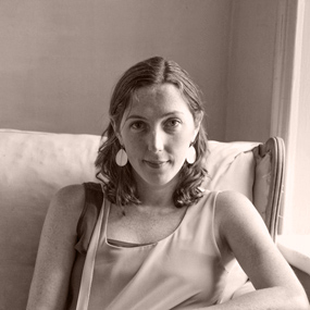
Anna Carnick
Anna is Pamono’s Managing Editor. Her writing has appeared in several arts and culture publications, and she's edited over 20 books. Anna loves celebrating great artists, and seriously enjoys a good picnic.
-
-
Photos by
-

Pedro Gething
Multitalented, full of good ideas, and curious about almost everything—especially his adopted home Berlin—Pedro is a Portuguese-British photographer with a degree in design. We like to have him in the office working on our photos as much as possible, but when we reluctantly let him go, he can be found traveling and just generally exploring the world.
-
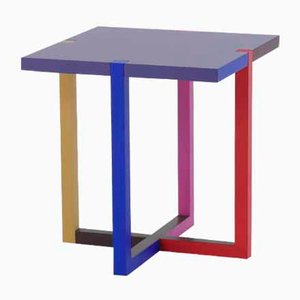
More to Love
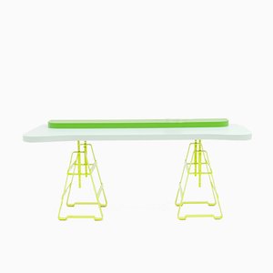
Lake Low Table by Martin Holzapfel
Rally Y Side Table by Martin Holzapfel, 2017
Rally X Side Table by Martin Holzapfel
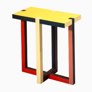
Rally Q Side Table by Martin Holzapfel
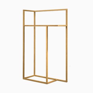
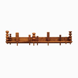
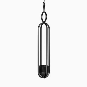
Coat Hanger by Martin Holzapfel, 2014
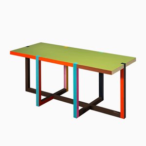
Crossing Dining Table by Martin Holzapfel, 2018
Regard Cabinet by Martin Holzapfel
Fontaine Bar by Martin Holzapfel
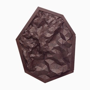
Intarsia Wall Piece 1 by Elisa Strozyk
Le Trèteau Table Bases by Zascho Petkow, Set of 2

Le Papillon Desk by Zascho Petkow, Wedekind, & Thesenfitz for Atelier Haussmann
Chatouiller Table Top by Zascho Petkow, 2016
La Garderobiere Coat Rack by Zascho Petkow
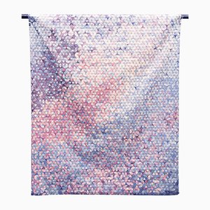
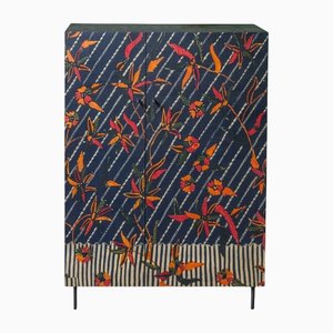
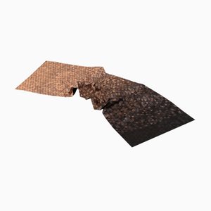
Fading Wooden Textiles by Elisa Strozyk
Septagon Bar Cabinet by Elisa Strozyk & Sebastian Neeb
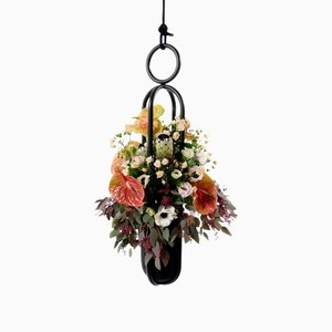
Blumenampel Edition, Hanging Planter by Zascho Petkow & Birgit Severin
Dyed Wooden Textile No 1 by Elisa Strozyk
Blumenkugel Object, Hanging Planter by Zascho Petkow & Andreas Haussmann
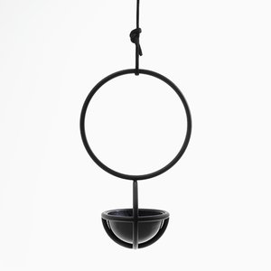
Blumenampel Object, Hanging Planter by Zascho Petkow
Paradis Bali Cabinet by Zascho Petkow, 2016
Wooden Table Runner by Elisa Strozyk
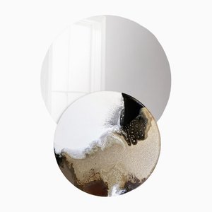
Overlap-Mirror No. 13 by Elisa Strozyk